Content-Creator
- Asset Management
- BestPractices
- Components
- Content creation
- Dashboard
- Manage extensions
- Page editor
- Video Tutorials
- Content Creator
Asset Management
The "Asset Management" area is your central media library. Here you can upload and manage all assets (media files such as images, audio, video, PDFs, etc.) that you would like to use later in your respective course content.
To access the Asset Manager, click on the menu button at the top left (1) and select "Asset Management". You will then be able to see all assets that have already been uploaded.
Attention: All users share the assets. This means that if you upload a picture in the Asset Manager, for example, the other users will also see this under "Asset Management".
The Asset Manager can be divided into the following areas:
1) Global Menu
2) Upload new asset
This function allows you to upload a new asset that you can later use in the respective course content.
To add a new asset in the Asset Manager, click on the "Upload new asset" button in the sidebar. Then select the desired file and give it a name, a description and appropriate tags. After clicking on "Save", the selected file is uploaded and displayed in the Asset Manager.
3) Filter assets
In this section you can select or filter which assets you want to display:
- Search by name: Only assets whose titles match the search criteria entered will be displayed.
- Image, Audio, Video, Other: Only assets of the corresponding file type will be displayed.
- Search by tag: Only assets whose tags match the search criteria entered will be displayed.
All three filter types can also be used in combination.
4) Show assets
The desired assets are displayed here.
5) Asset Detail View
As soon as you select an asset, the following details of this asset appear in this area:
- Name
- Description
- Weight
- Dimensions
In this area, you can also edit the asset (name, description, tags) via "Edit" or delete the asset via "Delete".
BestPractices
Link pages
If pages are to be linked, e.g. with the help of the "Page Jumper" component, the page ID of the target page to which the link is to be inserted is required. For example, a link for chapter 2 is to be inserted at the end of chapter 1. The component "Page Jumper" has already been inserted at the end of chapter 1, now it should be linked to the corresponding page.
Copy page ID of target page to clipboard
In the module overview, click on the properties of the target page (gear wheel in the upper left corner of the element) and select the "Copy ID to clipboard" entry from the context menu.
Now open the component "Page Jumper" in chapter 1. In the Properties block, the field name and the link can be added. The field name corresponds to the displayed text of the button and the link corresponds to the ID of the position to be jumped to.
Link to the overview page
Since the default overview page at the beginning of the module is not visible in the course content editor, no corresponding ID can be selected. For this case, simply add the character "#" in the link field in the "Page Jumper" component instead of the page ID.
Assessment
Create assessment
First, make sure that the "Assessment" extension is activated in the module (under "Manage Extensions").
Then, the basic data must be defined on the article in which the assessment is to be located:
| 1 | Switching the assessment extension on or off |
| 2 | Name of the assessment. This is only required if you want to insert several assessments in one module. If a content consists of only one test chapter, the designation can be ignored and thus left empty. |
| 3 | Number of attempts allowed (= work-throughs unless the required minimum pass rate has been met). -1 = unlimited number of attempts >0 = defined number of max. attempts (e.g. 3 = max. 3 attempts). |
| 4 | Score to be achieved to pass the assessment. |
| 5 | If the function is activated, the question elements (blocks) are displayed in a random order. |
| 6 | With the help of "Question Banks", questions can be divided into different (administrative) groups. This is required, for example, to compile test sets from a question pool with different chapters. The setting is made in the properties of the blocks: |
| 7 | The split function can be used to define how many questions from the individual chapters (Question Banks) should be randomly created for a test. e.g. our test chapter consists of 4 categories (Question Banks) with 10 questions each. From "chapter 1" 4 questions, "chapter 2" 3 questions each, "chapter 3" 5 questions each and from "chapter 4" their 2 questions should be randomly compiled to a set. In the Split field this would result in the following entry:4, 3, 5, 2 |
| 8 | If the function is activated, the authoring tool creates a random order of the individual chapters (question banks) when the test chapter is started. |
Evaluate assessment
The evaluation of an assessment is done with the help of the "Assessment Results" component.
The "Assessment Results" component must be located **in a separate article** outside the questions.
Afterwards, the component can be opened and edited by double-clicking on it.
Feedback after evaluation of the assessment
The feedback that should appear after the assessment is evaluated is entered in the "Feedback Text" field:
The following variables are available for the feedback text:
{{{attemptsSpent}}} -> number of attempts already performed
{{{attempts}}}**** -> number of attempts (total)
{{{attemptsLeft}}} -> number of remaining attempts
{{{score}}} -> score achieved by the learner
{{{scoreAsPercent}}} -> Percentage of success achieved by the learner (achieved score / max. score)
{{{maxScore}}} -> Maximum possible score
{{{feedback}}} -> Link to the feedback text, which can be created individually on the achieved score or success rate.
Under the entry "Bands" individual feedbacks have to be defined depending on the test result:
| 1 | Under the Score entry, the value for the feedback can be recorded. If participants reach the score (or percentage value), the corresponding feedback is displayed. |
| 2 | In the feedback text, the corresponding feedback can now be recorded, which is displayed when the participants reach the recorded score (or percentage value). |
| 3 | If the Allow Retry option is activated, the participants are given the opportunity to work through the test chapter again. The precondition for this is, of course, that they still have attempts left. |
In principle, as many "bands" as desired and required can be entered. With the button "Add" more "Bands" can be added at any time:
In the finished content, the above feedback then appears as follows, for example:
Create SCORM package
In order for test results to be saved on the LMS and expressed as a percentage, the following settings must be made.
The extension "Spoor" must be activated. Then the extension can be set in the Configuration settings.
The following checkmarks must be set for this:
The following settings must be made in the article settings of the article in which the assessment is located:
In the LMS, it then displays the test result as a percentage. The module is only "completed" when all chapters have been worked through.
In order to continue at the same point where you left the module on your next visit, the following settings must be made:
The extension "Bookmarking" must be activated. Afterwards the extension can be set in the Project settings:
Under "Level" select whether it jumps to a Page, Block or Component.
When re-entering, the following question will appear:
Components
The following components are available:
| Content components | |
|---|---|
| Assessment Results | Display of the results of a test chapter (assessments) |
| Chat | Creates a scenario-controlled 'group chat'. |
| Collapsible Boxes | Shows boxes with clickable titles that open and display text or images. |
| Graphic | Display of graphics |
| Graphic Zoomer | Display of zoomable graphics |
| Info Graphic | Graphic with clickable areas that open a pop-up or link. |
| Media | Playback of video and audio |
| Page Jumper | Button that allows you to jump to any article, block or component on any page |
| Text | Text display |
| Step-by-Step | A component that lists blocks one below the other using a Next button. |
| Footer Navigation | A text component with an icon or page numbers and a button that can be used to jump to any article, block, or component on any page. |
| Slide Show | A component that displays an image gallery with accompanying text. The component replaces the Narrative and Image Gallery components and can be used as an alternative to the Graphics component with text placement. |
| Question components | |
|---|---|
| Graphical Multiple Choice Question | A multiple choice question component with pictures |
| Matching Question | Matching question that allows the learner to select the answer(s) to the question via dropdown. |
| Multiple Choice Question | A multiple choice question component |
| Slider | A question component that allows the learner to position a slider on a scale. |
| Text Input | A question component that allows learners to enter answer text to a question. |
Insert and edit component
Components are inserted by clicking the "Add Component" button, selecting the desired component from the menu on the right.
The basic layout of the pages in Adapt is two-column. Therefore, when inserting the component, you can choose to display it in the left column ("Add to left") or in the right column ("Add to right") or across both columns ("Add full"). Of course, the two-column layout only applies to display on end devices with a sufficient screen size, such as tablets, notebooks or desktop computers. In the case of smartphones, the content is displayed one column below the other.
By double-clicking on the component that has just been inserted, the author enters the editing mode:
Content creation
Add a new course
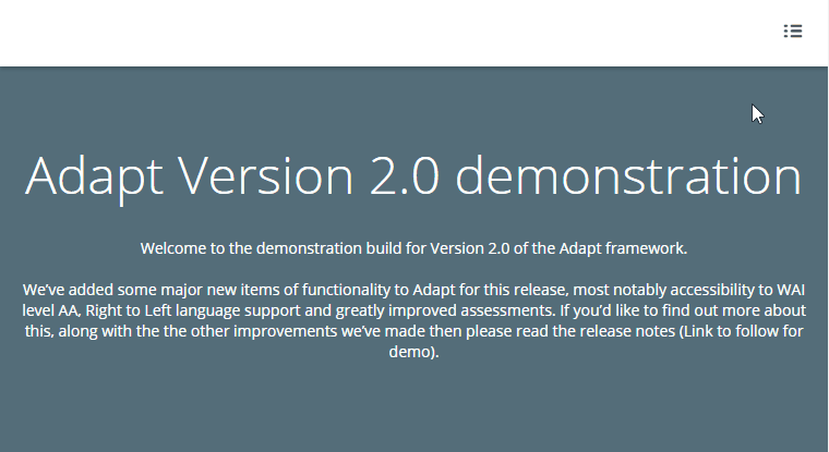
Selecting the "Add new course" button in the dashboard creates a new content and takes you directly to the Project Settings of the newly created content. As soon as all desired settings have been made, this is confirmed with the "Save" button. You will now be taken to the Course Content Editor of the newly created course content, where you can begin with the actual content creation:
Course content editor
You can access the course content editor by either clicking on "Add new course" in the dashboard or by double-clicking on an existing course content.
The course content editor can be divided into the following sections:
1) Publish course content
You can create a preview of the course content using the "Preview course" function. You can find more information on this under Preview course.
With the function "Publish course" you can export the course content as a ZIP package in order to import it e.g. in the Swiss Learning Hub (or in a learning platform of your choice).
2) Course Content Settings
- __[Project-] and [Configuration-Settings] : Various settings for the course content as a whole
- Theme-Picker : Adaptations to the course content layout (theme)
- __[Manage extensions] : Activate/deactivate extensions
3) Course content structure
In this area, the structure of the course content is built up:
- New pages and submenus can be added via "Add page" and "Add submenu".
- The respective cogwheel icon takes you to the corresponding page settings.
- Double-clicking on the page opens the Page Editor, where you can edit the corresponding page contents.
Preview course
To start a preview, select the "Preview course" button.
A new browser tab opens with the preview of the module. To continue editing the module, close the browser tab or switch to the previous tab.
To update the preview, select the "Preview course" button again. If the previous tab is still open, it will be updated with the new preview; if the tab has been closed, a new tab will open with the updated preview.
No empty blocks
Basically, it is possible to preview the progress of the content creation at any time. However, it must be ensured beforehand that there are no empty blocks. If a block without a component is inserted on a module page, the preview cannot be opened. The author's attention is drawn to this with a corresponding message.
Project settings
The project settings are divided into four areas:
General
General information is recorded in this area. Such as the name of the content, any description, tags or whether the content should be shared with other authors.
Extensions
Settings, for the various extensions. More information on the individual extensions and their settings can be found under "Manage Extensions".
Start settings
In this block, various settings can be made as to how or on which page the module should start. e.g. whether the content should start directly with a defined page. If this is not activated, the authoring tool starts chronologically with the display of the menu in the recorded order.
Globals
This is where the higher-level information and settings are made. Such as feedback or component texts for the entire module, etc.
Buttons
In this area, all button labels for the entire module can be customised. For example, when creating a new module, all button labels are created in English by default. These can be adapted here accordingly for all buttons.
Configuration settings
Here is a list of the most important settings that are made in the Configuration Settings:
| General | General settings for module language, text direction, question weighting |
| Extensions | Settings, for the various extensions. More information on the individual extensions and their settings can be found at manage-extensions. |
| Completion criteria | Setting when the module is considered "Completed": - As soon as all contents have been processed - As soon as all assessments have been completed - As soon as all contents AND all assessments have been completed |
More detailed information on all configuration settings can be found on the corresponding page in the official documentation of ADAPT.
Dashboard
The dashboard is the standard start page that you reach after logging in and where you can see all course content that has already been created with the Content Creator.
The dashboard can be divided into the following sections:
1) Global menu
2) Create new course content
This function allows you to create a new course content. For more information, see Create a new course content.
3) Filter course contents
In this area you can select or filter which course content you want to display in the dashboard (4):
- My courses: Only your course content is displayed (standard setting).
- Shared courses: All course content that other users have set as "shared" is displayed.
- Search by name: Only course content whose title matches the search criteria entered will be displayed.
- Search by tag: Only course content whose tags match the search criteria entered will be displayed.
4) View and edit course contents
The desired course content is displayed here, which can then be opened and edited by double-clicking.
By clicking on the cogwheel icon, additional functions can be called up for the course content:
- Edit: Course content is opened in edit mode (analog to double-clicking).
- Copy: A copy of the course content is created.
- Copy ID to clipboard: The course content ID is saved to the clipboard.
- Delete: Deletes the course content
5) Display settings
With these functions, you can set whether the course contents are to be displayed as a grid or list view. And whether they should be sorted alphabetically or by creation date.
6) Edit user profile
First name, last name and password can be changed here.
Manage extensions
As soon as an extension is activated, it can then be configured accordingly in the project or configuration settings of the module.
Assessment
An extension that is attached to an article to group different question components and provide an assessment with feedback.
Assessment Countdown
An extension that allows a timer/countdown to be set on a test that forces the test to be scored after the specified time has elapsed.
Bookmarking
With this extension, the learner's current location within the module is saved so that when they exit and restart, they have the option to continue at the same point where they left the module.

Glossary
Displays a list of glossary terms in the side panel.
Page Incomplete Prompt
Displays a message box if the learner attempts to exit a page without completing all components.
Page Level Progress
Shows the learner's page progress by means of a progress bar displayed in the top navigation bar. Progress is calculated as a percentage of the subordinate components that have already been completed. Clicking on the progress bar opens the side panel to show the completion status of each component. The page progress can also be displayed on the individual chapter overview tiles.


Resources
Displays a list of additional documents in the side panel.

Search
An extension that allows the whole module to be searched for certain keywords. The search is displayed in the side panel, which slides out from the right side of the module. It is accessible to the learner at any time via an icon in the navigation bar.
Spoor
An extension that enables easy SCORM tracking.
Trickle
Prevents vertical scrolling. This allows you to create step-by-step instructions, for example, by blocking certain content areas.

Tutor
An extension that provides a basic feedback overlay for question components.
Detailed Feedback
Enables the display of inline feedback for questions; i.e. the feedback text does not appear in a pop-up above the question, but below the question and the answer alternatives, so that the user can see and compare everything at once: the question, the answer alternatives, the indication of right/wrong (solution) and the feedback text. This text also remains on the page and can be read again when the user returns to the page/module.
Page editor
You can access the page editor by double-clicking on an existing page in the course content editor.
The page editor can be divided into the following areas:
1) Page settings
Double-click or use the cogwheel icon to access the corresponding page settings.
2) Page layout
The page structure in the page editor follows the A-B-C structure. Each page consists of articles, blocks and components.
3) Display settings
In this area you can select whether you want to display all items expanded or collapsed.
A-B-C structure
| A | Article | Top level, comparable to "Heading 1" in Microsoft Word. Used to divide long pages into coherent sections. | |
| B | Block | The components are arranged within a block. One full-width component or two half-width components can be inserted per block. | |
| C | Component | Content and question components can be inserted. For an overview of all components and how to insert a component, see section Components. |
Video Tutorials
Create a course content
Add pages and components
Link pages together
Duplicate existing course content
Set a course content as a test
Customize page overview
Change starting page
Add resources
Add glossary
Infographic
Trickle
Map Menu
Footer navigation
Content Creator
The Content Creator is the official cloud-based authoring tool of the Swiss Learning Hub with which you can quickly and easily create responsive learning modules.